查看效果: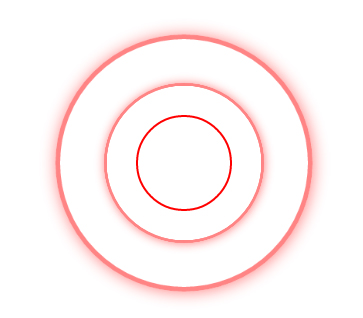
先來個簡單的示例,例如:
@keyframes hovertreemove
{
from {top:30px;}
to {top:130px;}
}
效果:
可以通過 @keyframes 規則,創建動畫。
創建動畫的原理是,將一套 CSS 樣式逐漸變化為另一套樣式。
在動畫過程中,您能夠多次改變這套 CSS 樣式。
以百分比來規定改變發生的時間,或者通過關鍵詞 "from" 和 "to",等價于 0% 和 100%。
0% 是動畫的開始時間,100% 動畫的結束時間。
為了獲得最佳的瀏覽器支持,您應該始終定義 0% 和 100% 選擇器。
以下為上下運動的代碼:
<!DOCTYPE html>
<html>
<head>
<meta http-equiv="Content-Type" content="text/html; charset=utf-8"/>
    <meta name="viewport" content="width=device-width, initial-scale=1" />
    <title>css3使用animation和@keyframes制作動畫_何問起</title>
    <meta charset="utf-8" />
    <style>
@keyframes hovertreemove
{
from {top:30px;}
to {top:130px;}
}
#hovertreekf{
    width:80px;height:80px;
    border:1px solid red;
    position:absolute;
    background:url(images/smile.png) no-repeat center;
    animation:hovertreemove /*動畫樣式名稱*/
        1s /*動畫時間*/
    linear /*線性運動*/
        infinite /*無線播放*/
        alternate/*往返動畫*/;
}
  a{color:blue;text-decoration:none;}  </style>
</head>
<body><a href="bjaf/i309b77d.htm" target="_blank">說明</a>
    <div id="hovertreekf"></div>
</body>
</html>
以下為圓形擴散運動的代碼:
<!DOCTYPE html>
<html>
<head>
    <meta http-equiv="Content-Type" content="text/html; charset=utf-8" />
    <meta name="viewport" content="width=device-width, initial-scale=1" />
    <title>純css3圓形從中心向四周擴散動畫效果_何問起</title>
    <style>
        @keyframes warn {
            0% {
                transform: scale(0.3);
                -webkit-transform: scale(0.3);
                opacity: 0.0;
            }

            25% {
                transform: scale(0.3);
                -webkit-transform: scale(0.3);
                opacity: 0.1;
            }

            50% {
                transform: scale(0.5);
                -webkit-transform: scale(0.5);
                opacity: 0.3;
            }

            75% {
                transform: scale(0.8);
                -webkit-transform: scale(0.8);
                opacity: 0.5;
            }

            100% {
                transform: scale(1);
                -webkit-transform: scale(1);
                opacity: 0.0;
            }
        }

        @keyframes warn1 {
            0% {
                transform: scale(0.3);
                -webkit-transform: scale(0.3);
                opacity: 0.0;
            }

            25% {
                transform: scale(0.3);
                -webkit-transform: scale(0.3);
                opacity: 0.1;
            }

            50% {
                transform: scale(0.3);
                -webkit-transform: scale(0.3);
                opacity: 0.3;
            }

            75% {
                transform: scale(0.5);
                -webkit-transform: scale(0.5);
                opacity: 0.5;
            }

            100% {
                transform: scale(0.8);
                -webkit-transform: scale(0.8);
                opacity: 0.0;
            }
        }

        .container {
            position: relative;
            width: 40px;
            height: 40px;
            /*border: 1px solid #000; hovertree.com */
        }
        /* 保持大小不變的小圓圈 何問起 */
        .dot {
            position: absolute;
            width: 92px;
            height: 92px;
            left: 120px;
            top: 120px;
            -webkit-border-radius: 50%;
            -moz-border-radius: 50%;
            border: 2px solid red;
            border-radius: 50%;
            z-index: 2;
        }
        /* 產生動畫(向外擴散變大)的圓圈  */
        .pulse {
            position: absolute;
            width: 320px;
            height: 320px;
            left: 2px;
            top: 2px;
            border: 6px solid red;
            -webkit-border-radius: 50%;
            -moz-border-radius: 50%;
            border-radius: 50%;
            z-index: 1;
            opacity: 0;
            -webkit-animation: warn 2s ease-out;
            -moz-animation: warn 2s ease-out;
            animation: warn 2s ease-out;
            -webkit-animation-iteration-count: infinite;
            -moz-animation-iteration-count: infinite;
            animation-iteration-count: infinite;
            box-shadow: 1px 1px 30px red;
        }

        .pulse1 {
            position: absolute;
            width: 320px;
            height: 320px;
            left: 2px;
            top: 2px;
            border: 6px solid red;
            -webkit-border-radius: 50%;
            -moz-border-radius: 50%;
            border-radius: 50%;
            z-index: 1;
            opacity: 0;
            -webkit-animation: warn1 2s ease-out;
            -moz-animation: warn1 2s ease-out;
            animation: warn1 2s ease-out;
            -webkit-animation-iteration-count: infinite;
            -moz-animation-iteration-count: infinite;
            animation-iteration-count: infinite;
            box-shadow: 1px 1px 30px red;
        }a{color:blue;text-decoration:none;}
    </style>
</head>

<body><a href="bjaf/i309b77d.htm" target="_blank">說明</a>
    <div class="container">
        <div class="dot"></div>
        <div class="pulse"></div>
        <div class="pulse1"></div>
    </div>
</body>
</html>

【 微信掃一掃 】